Just like ANY CSS – all you need to know is the name of the class or id that you want to change…
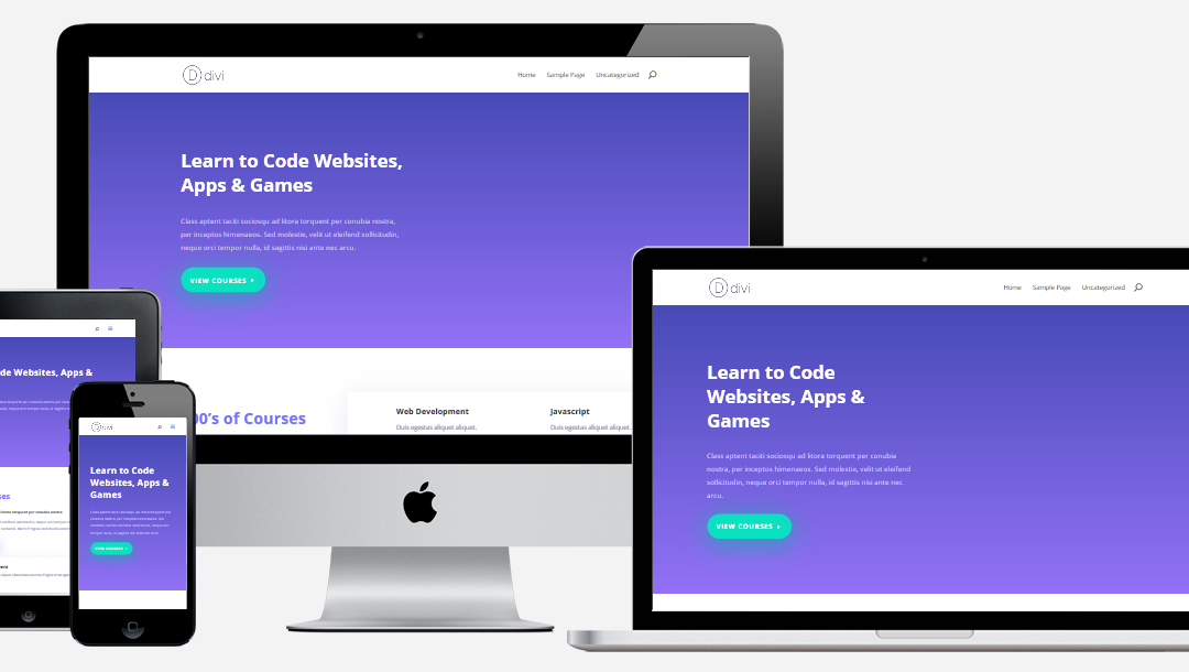
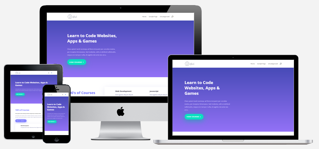
Here’s something I just did a few minutes ago. There was WAY too much padding on the mobile version of a page title on a Divi site – so the element in question was .et_pb_section class, but it could be anything.
Meaning you will need to find out what the name of the element you need to change/fix before you can setup media queries to set different css styles to your responsive theme. I would like to believe that if you are reading this, you don’t need css dumbed down THAT much, right? 😉
So this is the default padding for this section:
.et_pb_section {padding: 50px 0;}
50 pixels isn’t THAT much on a full sized monitor but it is HUGE on tablets and phone! It looked like the title was hanging out in the middle of the screen…
So here’s how it works:
This goes right into your custom css just like any other css code:
@media all and (max-width: 980px) {
.et_pb_section {padding: 0;} <- this is a “normal/regular” css rule
}
@media all and (max-width: 980px) – this is the media query – it means all screens UP TO 980px should use this code.
That’s it – media queries in a nutshell – it’s just a container that has a width at which it should be applied.
And you can use different screen sizes to customize anything you can control via css – which is damn near everything…